Little White Lies - Book Cover
College Work - This range of work was produced during my time on Level 3 Graphic Design.
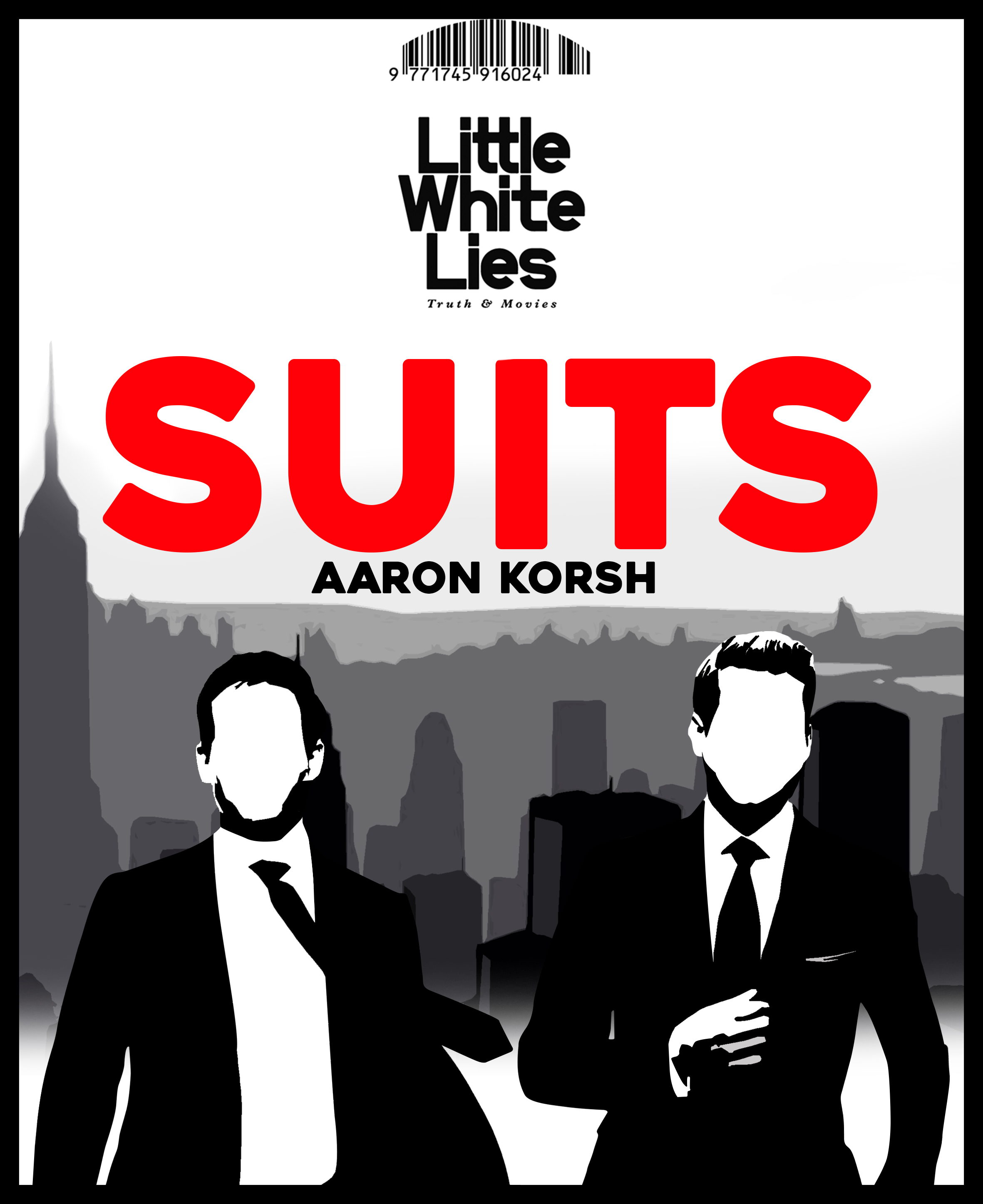
This is the piece which was made for the Little White Lies brief. I was tasked to make a book cover for the Little White Lies book, it can include any design I would like but it needed to match the dimensions, style and theme they all follow on each copy.

Initial Ideas:
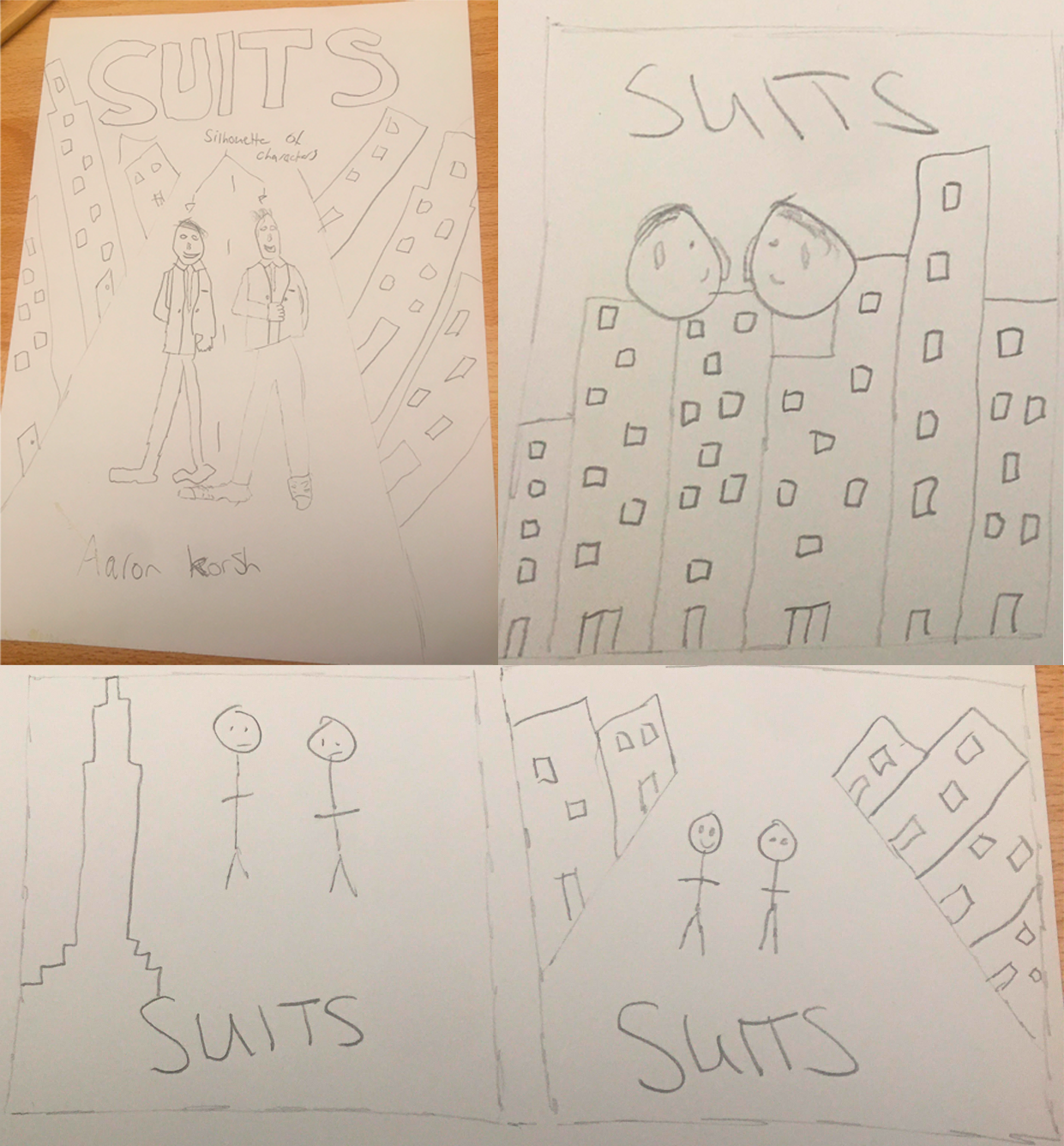
For the first idea, I want to use the same colours which are used in most of the tv covers (white, red and gray) and do some sort of silhouette design with the main characters Harvey and Mike in the middle. On the left side you can see a sketch of the cover I have in mind, I’m wanting the middle characters to be a silhouette, city background and a road with the Suits text at the top with the creator Aaron Korsh.

Design Process - Silhouette:
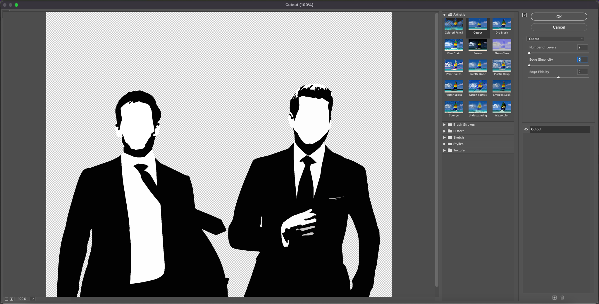
For my final piece I decided to include the main characters of the tv show Harvey and Mike. I also wanted to use a similar type of style they use with the city in the foreground and the typical font they use. However I couldn’t use the exact same font type as that would be borderline copying their ideas. So I decided to use a similar font which fits with the type of design I’m going for. Starting with the characters, I found a copyright free image which has the two characters in and thought I would change up the look of it and remove their faces, make it black and white and change it up. So what i did was go into Filter Gallery > Artistic > and then clicked on Cutout. I decided to move up the Number of Levels, Edge simplicity and Fidelity so there was a silhouette on both of the characters. I like this effect because it makes it unique to look at as the makers of the Suits covers haven’t done a design like this before, also Silhouette effects changes the perspective of the art and adds a different type of atmosphere to the piece.

Design Process - Typeface:
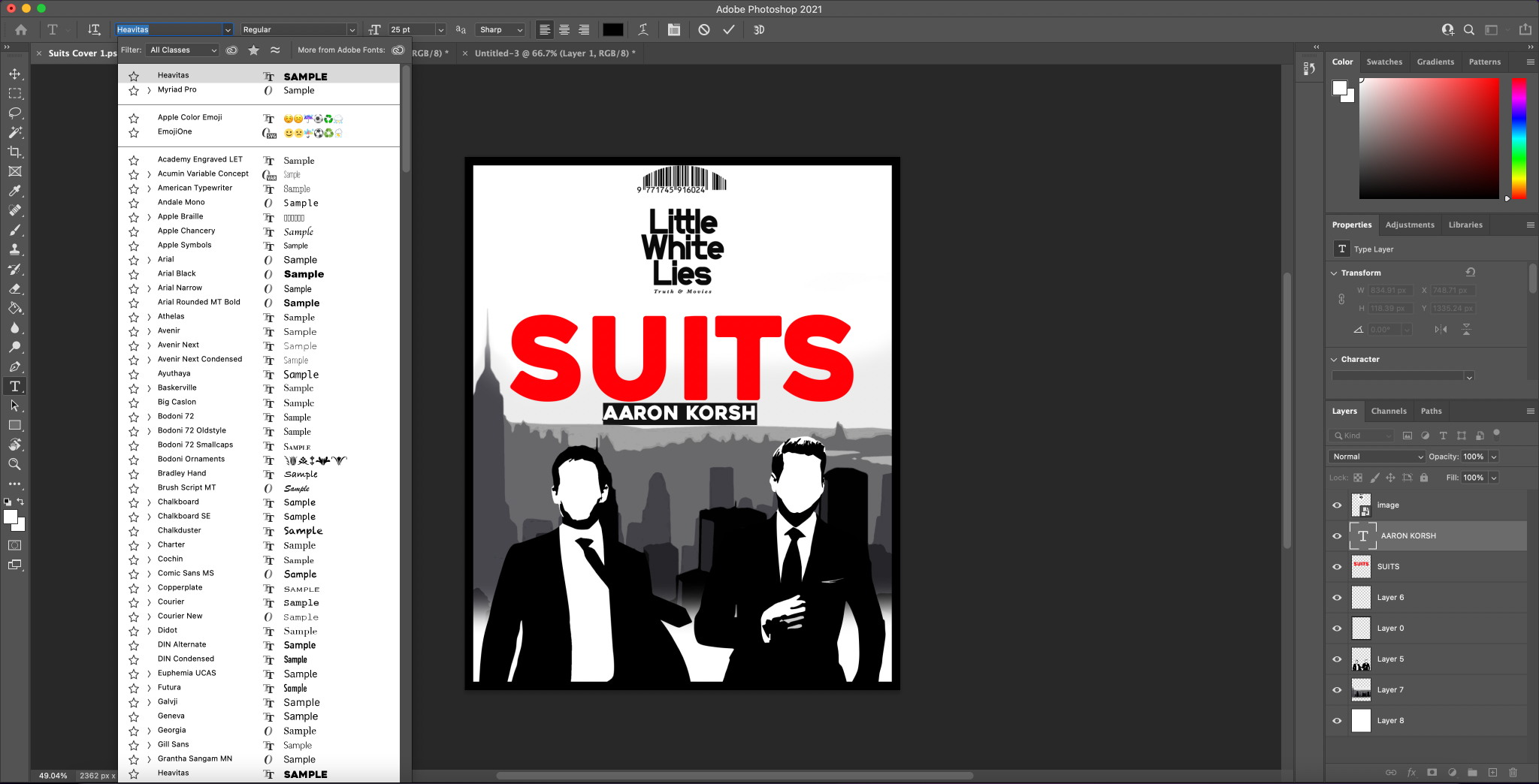
So I decided to use the typeface “Heavitas” which is shown above in the picture. The Suits in the middle of the cover is very iconic and decided to keep it in my cover as well, The overall style and look of the font is amazing. The curvature in the font fits with the style of the cover and with the red which is used in the original Suits covers. I also think the Suits and author texts fills the blank space in the piece so it helps get rid of empty areas and fills it up with the title.
